Plotting NCAR MUSICA outputs using R
library(ncdf4)
library(colorout)
library(ggplot2)
library(cptcity)
fc <- list.files(path = "/glade/scratch/sibarra/SAAP/run",
pattern = "SAAP.cam.h0.2014",
full.names = T)
nc <- list.files(path = "/glade/scratch/sibarra/SAAP/run",
pattern = "SAAP.cam.h0.2014")
dates <- as.Date(nc, format = "SAAP.cam.h0.%Y-%m-%d-00000.nc")
nd <- paste0(strftime(dates, "%Y%m%d"), ".nc")
mi <- map_data('world', wrap=c(0,360))
# geo ####
lat <- ncvar_get(nc1, varid = "lat")
lon <- ncvar_get(nc1, varid = "lon")
#PM25 ####
x <- ncvar_get(nc1, varid = "PM25")
dtx <- data.table::data.table(
lat = lat,
lon = lon,
x = x[, 32]*1e9
)
summary(dtx)
rc <- classInt::classIntervals(var = dtx$x,
n = 100,
style = "quantile")$brks
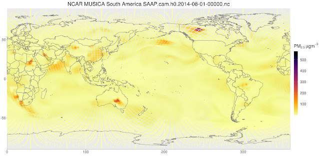
ggplot(dtx,
aes(x = lon,
y = lat,
colour = x),
alpha = 0.3) +
geom_point() +
scale_colour_gradientn(expression(PM[2.5]~mu*g*m^{-3}),
colours = cpt(rev = T),
values = rc/max(rc)) +
geom_polygon(data = mi,
aes(x = long,
y = lat,
group = group),
fill = NA,
colour = "grey50") +
coord_quickmap() +
labs(x = NULL, y = NULL,
title = paste0("NCAR MUSICA South America ", nc[32])) +
scale_x_continuous(expand = c(0, 0)) +
scale_y_continuous(expand = c(0, 0)) +
theme(text = element_text(size = 20),
legend.key.height = unit(4, "lines"),
plot.title = element_text(hjust = 0.5))
rc <- classInt::classIntervals(var = dtx[lon > 250 & lon < 350 &
lat > -60 & lat < 15]$x,
n = 100,
style = "sd")$brks
ggplot(dtx[lon > 250 & lon < 350 &
lat > -60 & lat < 15],
aes(x = lon,
y = lat,
colour = x),
alpha = 0.3) +
geom_point(size = 3) +
scale_colour_gradientn(expression(PM[2.5]~mu*g*m^{-3}),
colours = lucky(rev = T),
values = rc/max(rc)) +
geom_polygon(data = mi,
aes(x = long,
y = lat,
group = group),
fill = NA,
colour = "grey50") +
coord_quickmap(xlim = c(250, 350),
ylim = c(-60, 15),
expand = c(0,0)) +
labs(x = NULL, y = NULL,
title = paste0("NCAR MUSICA South America ", nc[32])) +
theme(text = element_text(size = 20),
legend.key.height = unit(4, "lines"),
plot.title = element_text(hjust = 0.5))


The visualization method greatly switch free game clarifies complex atmospheric data. Providing sample scripts makes it much easier for readers to duplicate the analysis.
ResponderEliminar